Every day, people visit your store and leave because they couldn’t find what they wanted.
You need more than top rankings on Google. People have to be able to navigate to the product they want and trust you enough to buy. Your website’s user experience (UX) should focus on building your visitor’s confidence by helping them complete their goals.
Home Page UX Tips That Build Trust On A Quick Glance
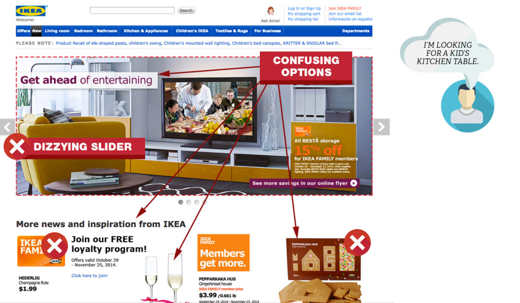
Your home page gets the most traffic. Make it obvious that you sell products. Think of your home page as the window to your store. Think Macy’s on Magnificent Mile. Dress your home page with your best products and images. One thing you never see at Macy’s is different dresses swooping by one by one in the window. I’m talking about sliders here. If you have to use them, make sure they are user friendly.
Hero Area Best Practices
Your hero area (also called featured area) is the most prominent real-estate on your home page. You only have 50 milliseconds to leave a good impression, here is how to make it count.
Hero Area Do’s
- Use simple, uncluttered design. Use as few words as possible.
- Eliminate everything that does not make an impact. For example, your recent blog posts.
- Use visual queues like color or arrows to focus attention on a single call to action.
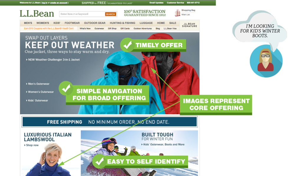
- Make it easy for people to self identify. Do you sell pricy jackets for women?
Hero Area Dont’s
- Decorate. Swirls, sparkles, and other meaningless symbols add to the cognitive load and distract your customers.
- Have outdated content like promotions from last week or even last month. You will instantly lose credibility.
- Clutter the area with too many messages or promotions.
- Have an automatically advancing slider or carousel.
- Emphasize a product that is not representative of your overall mix.
Home Page Navigation
When people visit your site, you want to help them find what they came for. According to conversion expert, Tim Ash, the main focus of your home page is to provide category level navigation. Follow these pointers to help visitors find what they are looking for.
Home Page Navigation Do’s
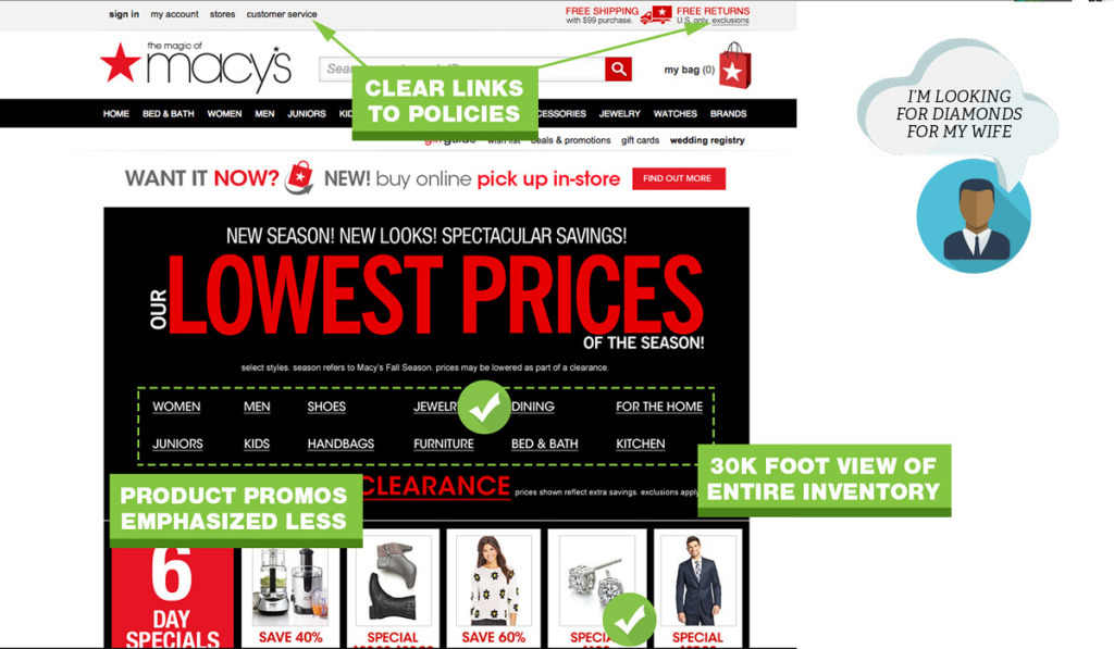
- Give visitors a “30,000 foot view” of what your site sells so they can drill down to specific categories.
- Add your most used tools or buying guides.
- Provide links to return policy, customer service, shipping and privacy pages.
Home Page Navigation Dont’s
- Assume you know what people are looking for.
- Jam every category and subcategory on your home page.
- Push product level promotions. If you only have a few products, you can ignore this.
- Use generic stock photos. This screams inauthenticity.
Solid Ecommerce User Experience Boils Down To Simple Primary Navigation
Navigation is critical when you have a lot of categories, variable products or products with many options. Nothing is more frustrating than a cumbersome menu. The quicker people can find what they want, the quicker you can move them through to the checkout process.
The purpose of a navigation menu is to get people where they want to go. Here is a breakdown of what you should address:
Primary Navigation Menu Do’s
- Limit top menu to 7 choices.
- Use a secondary navigation at the top right for items like “Contact Us”
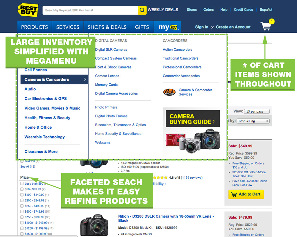
- Use a multi column menu that organizes categories and sub categories.
- Show high quality images of your product.
- Make your navigation menu prominent with contrasting colors.
- Cross reference products into multiple categories. Someone looking for a USB drive may look under Laptop, Accessories, or Computers.
Primary Navigation Menu Dont’s
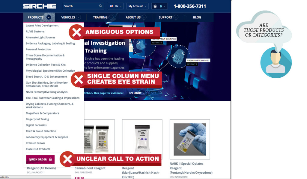
- Have a single drop down that takes up a long column.
- Show link empty category pages to main nav.
- Over-classify products. If there is only one product in a (sub)category, remove the category and reclassify the product.
- Don’t use vague options like “more.”
Cart Menus
A cart menu is likely the last button a user will click before taking out the credit card. Don’t over look this tiny icon.
Cart Menu Do’s
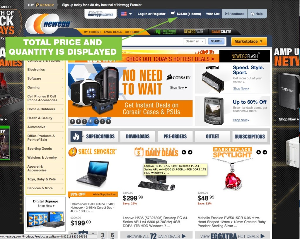
- Show total price and number of items in cart.
- Link to the cart page where they can see details of their contents
Cart Menu Dont’s
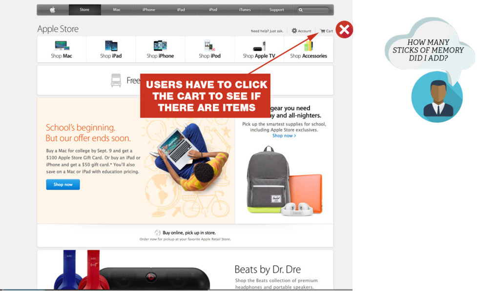
- Substitute a “mini cart” for a full cart. Your ecommerce site, needs a cart page, not just a cart widget.
- Link directly to a checkout page that doesn’t show every detail of the products in the cart.
Search
Many users skip the navigation menu altogether and rely on search/faceted search to drill down further. Faceted search can get complicated quickly. From a development and cost perspective, but also a user perspective. Follow these guidelines to keep things simple and helpful.
Search Do’s
- Use an open text field box at the top of every page.
- Use faceted search when there are over 20 products within a category.
- Filter by price, color, size are basic faceted search options.
Search Dont’s
- Use filler text on search input. Leave it blank, or say “Search.”
- Use subjective filtering options such as “heavy-duty” or “light-duty.”
Ecommerce UX Tips For Product Pages
Full product details are critical. For SEO and for user experience. Internal links boost SEO and help the user navigate back to the product listings page. A user friendly layout will have essential product information above the fold.
Product pages are the meat of your site, they need to convert. If your customer has to select an option before adding to cart, display an error message when the “Add to Cart” button is clicked.
Product Page Content Layering
Your product page can quickly suffer from information overload. You want the right level of product information for people that already know what they want to buy, but also cater to shoppers that need every last product detail. By layering your information, you can cater to both types of buyers.
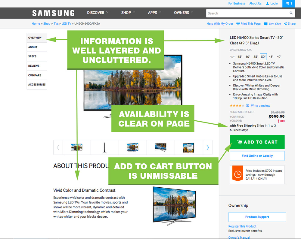
Product Page Content Layering Do’s
- Provide a short product summary at the top of the page or next to the photo.
- Add a border or shaded background to your “action area” – where people select options and click your button.
- Present the ordering options near the top in the action area
- Have breadcrumbs on the product pages.
- Put product details, reviews, data, etc. below the product image and CTA area.
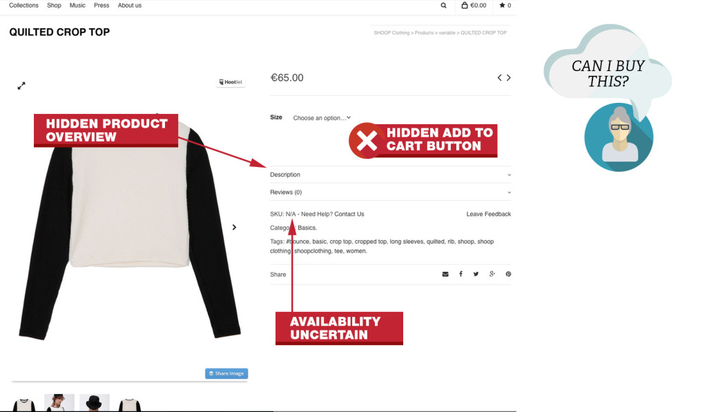
Product Page Content Layering Dont’s
- Put a large block of copy near or above the CTA button.
- Hide your add to cart button until someone makes a selection.
- Make availability information an extra click away.
- Have a subtle change when someone clicks your add to cart button. People will miss your “Successfully added” message.
A common mistake with many WordPress ecommerce themes was hidden “Add To Cart” buttons.
Product Page Images
Large photos and zoom is about the closest your buyer can get without physically touching the product. Fuzzy, poor quality images make the products look poor quality too. Check out this case study, where bigger, better product images increased conversions by over 300%.
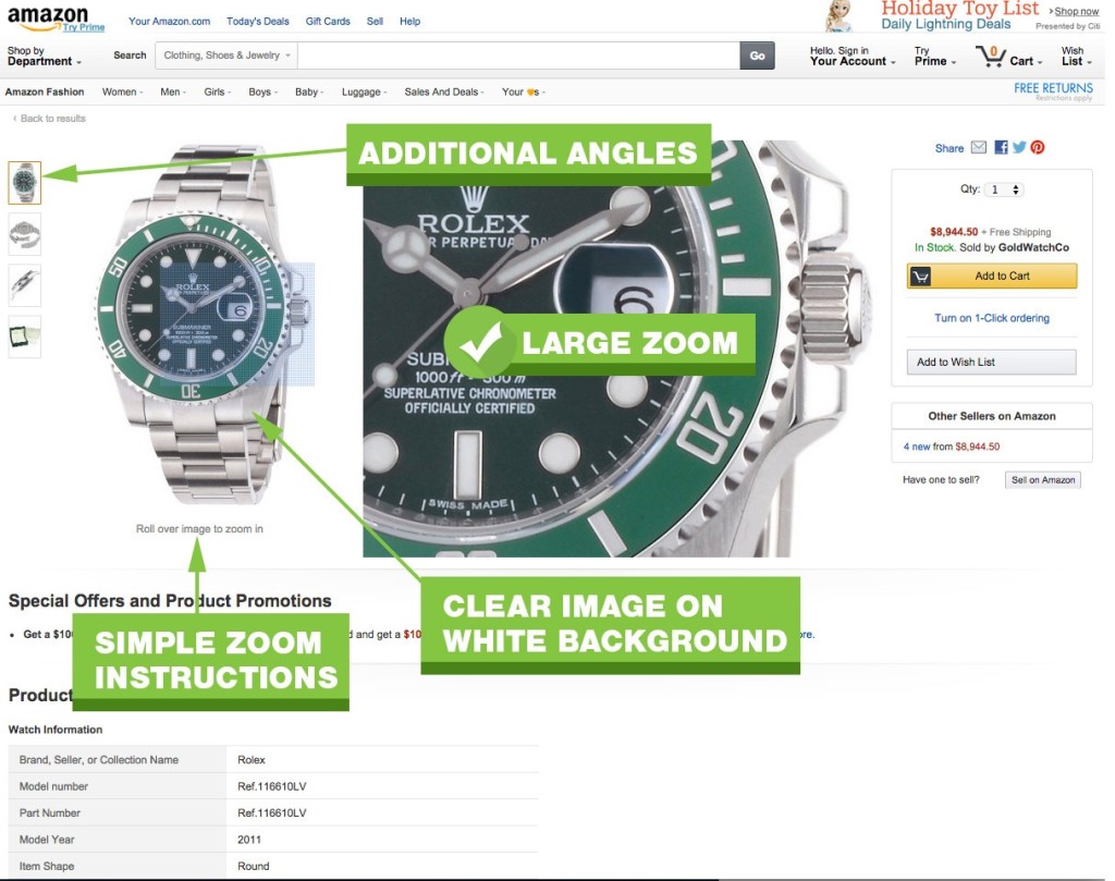
Product Page Images Do’s
- Use large, high res photos on a white background.
- Use zoom features to let users see details for themselves.
- Allow users to scroll to back and forth between images.
- Provide clear instructions that additional images or zoom features are enabled.
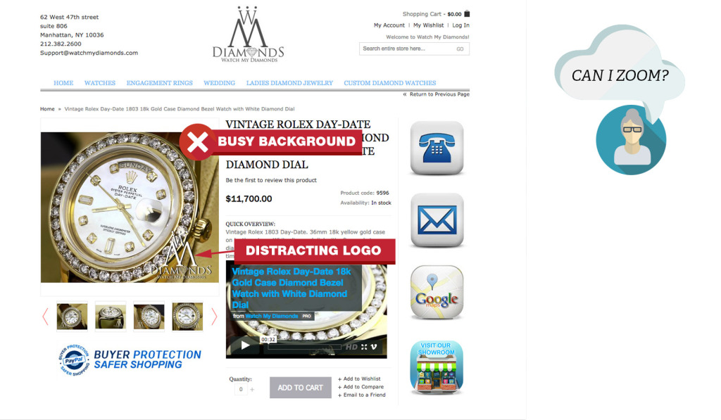
Product Page Images Dont’s
- Show “lifestyle” images or your product. Show just the product.
- Don’t muddy up your photos with logos, watermarks or backgrounds.
- Force an image pop-up to see more details or additional photos.
Build Trust With Buyer Friendly Checkout Process
Your checkout process needs to be simple, logical and distraction free. Don’t complicate it. Macy’s cart page hits many of the main points. The cart shows product details with images, pricing, tax and links back to individual product pages.
Cart Page
The first page in your checkout process is your cart page. You never want to send a user past this page. This page reaffirms what they have purchased in detail. This helps them build confidence and trust in your store.
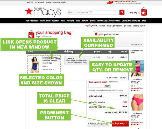
Cart Page Do’s
- Confirm everything. Product, size, color, quantity, availability, ship date, estimated delivery.
- Allow users to navigate directly back to products in their cart.
- Make it easy to change quantity or delete products. Let users change qty to 0 to remove products or click a “remove” button.
- Show a picture of the product, in the color it was ordered in. If your customer orders a black jacket and sees a blue one at checkout, they lose confidence.
- Make the continue checkout button prominent, but allow people to continue shopping.
- Show the total out the door price.
Cart Page Presentation Dont’s
- Prematurely ask for a credit card or email address. Let people confirm what they are buying.
- Don’t use an “Update” button to remove products.
Checkout Page
After buyers feel confident that they are ordering the right product from the right company (yours), it is time to get the party started.
Once users start the checkout process, they want to complete the purchase as quick as possible. Help them help you. Remove distractions and make the process as easy as possible. Don’t make them re-enter their address or guess how to complete the form.
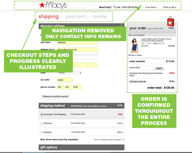
Checkout Page Do’s
- Ask for only the minimal required information.
- Replace the main navigation with a “contact” navigation.
- Keep your checkout process short and your steps clear and logical.
- Show progress during the checkout process.
Checkout Page Dont’s
- Present new information or choices.
- Force people to “join” or “become a member.”
- Make people re-enter the same information twice.
- Let users use billing address as shipping address with a single click.
How Does Your Site Stack Up?
You don’t have to have a million dollars to create a positive user experience. Nail these basics and you will get Google and customers to love your site and buy from you.
Interested in learning more about mobile shopping guidelines? Join our webinar on February 10, on “Mobile Shopping: Key Features Users Want” hosted by Michel Sharritt, VP of CueCamp and Situated Research.
Written by: Darren Dematas, Intertwine
Posted by: CueCamp