Our discussion will focus on menu navigation of a website, and we have chosen to review Standard Market’s website. Standard Market is a local high-end grocery store with a restaurant and taproom.
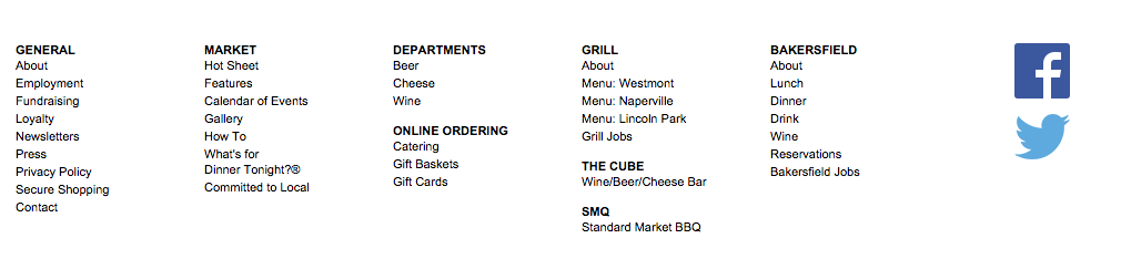
When we review main menu navigation on websites, the first thing we examine is the menu location. Users want to see the main menu navigation at the top of the page versus the page footer as observed on the Standard Market website. Why? Users are used to seeing the menu navigation on most websites at the top of the page. Additionally, users do not want to have to scroll through a site to find what they are looking for, or to start a search query.
The next thing we look at is labeling. We asked users to find out what beer was on tap at the Naperville Standard Market location. Users first looked at the top of the site to find the main menu navigation, and when they didn’t find it, they scrolled down. Many users said they will leave a website and give up on their search when navigation is missing, or they simply find the contact information and give them a call to ask their question.
Next our users were confused with the labeling of the menu options that they found. Under DEPARTMENTS they found a label named Beer. But then under the label THE CUBE, they found wine/beer/cheese bar. This is an example of poor labeling, as ‘Beer’ is located under two different menus. This confuses users and makes them unsure of what to click on to find the information they want. It also makes the search process longer and more difficult for the user.
It took users several minutes to navigate through the website to find the information they wanted, which caused frustration, confusion, and lowered the likelihood that they would return to the site in the future.
CueCamp helps clients alleviate these kind of frustrations users by carefully organizing web content and creating clear, distinct labels for good website navigation. CueCamp offers a free usability report that reviews 20 different areas of usability in your website, including menu navigation. The report is straightforward and easy to follow, and includes a one-on-one review to ensure any follow-up questions are fully answered.
To request your free usability report, visit www.cuecamp.com and simply fill out the short form. You will have your report within 48 hours. If you have any questions or feedback, please feel free to leave them in the comments below.
Written / Posted by: CueCamp